
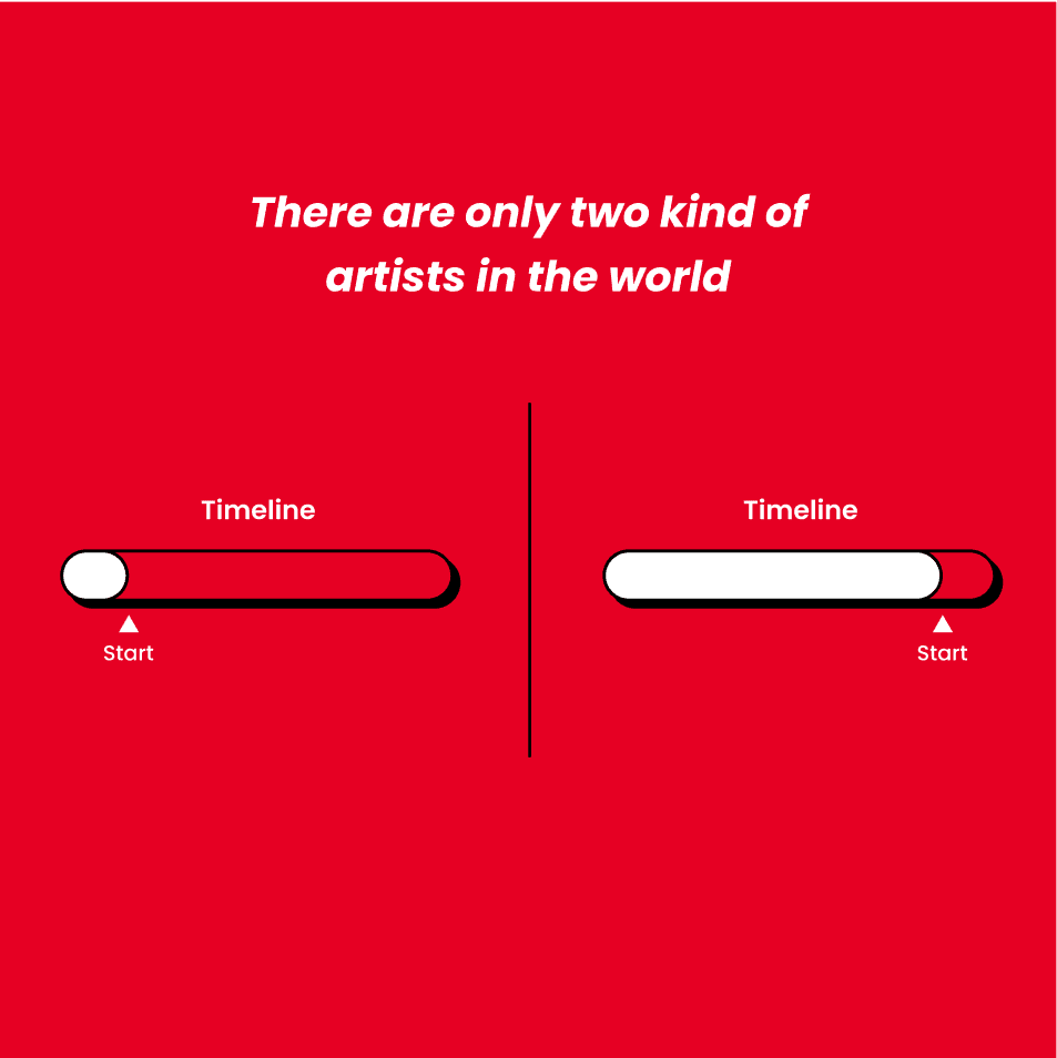
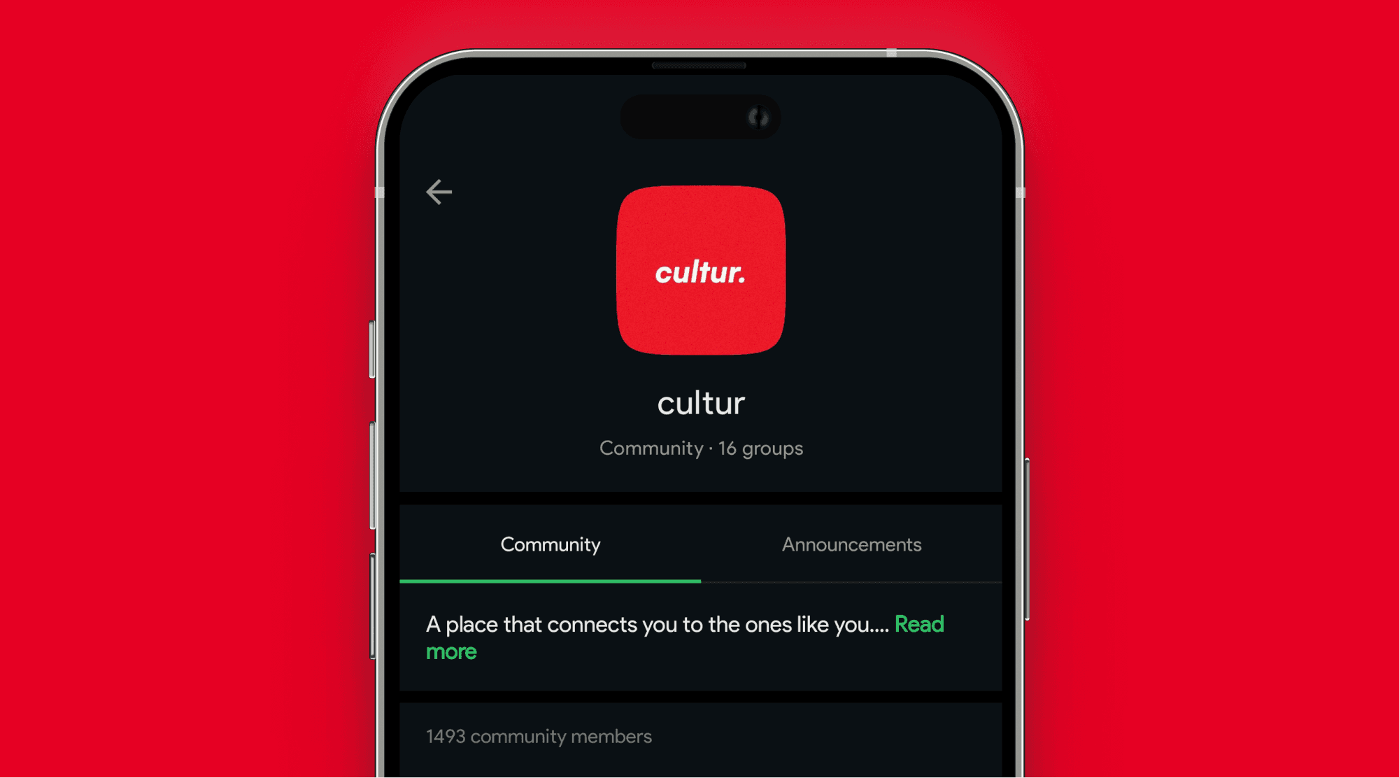
cultur - A place that connects you to the ones like you.
cultur began not in a studio, but on a cold mountain road in Manali, Himachal Pradesh.
In November 2019, after a long journey from Kerala to Rohtang Pass, I found myself reflecting deeply during a bike ride through the snow-covered mountains. A friend casually asked, “Should we start something of our own back home?” That question stayed with me.
The next morning, seeing my camera bag beside me, I realized that this trip wasn’t just about travel — it was about creating, capturing, and reconnecting with purpose. As a designer and artist, I felt the need to build something that connected people like me.
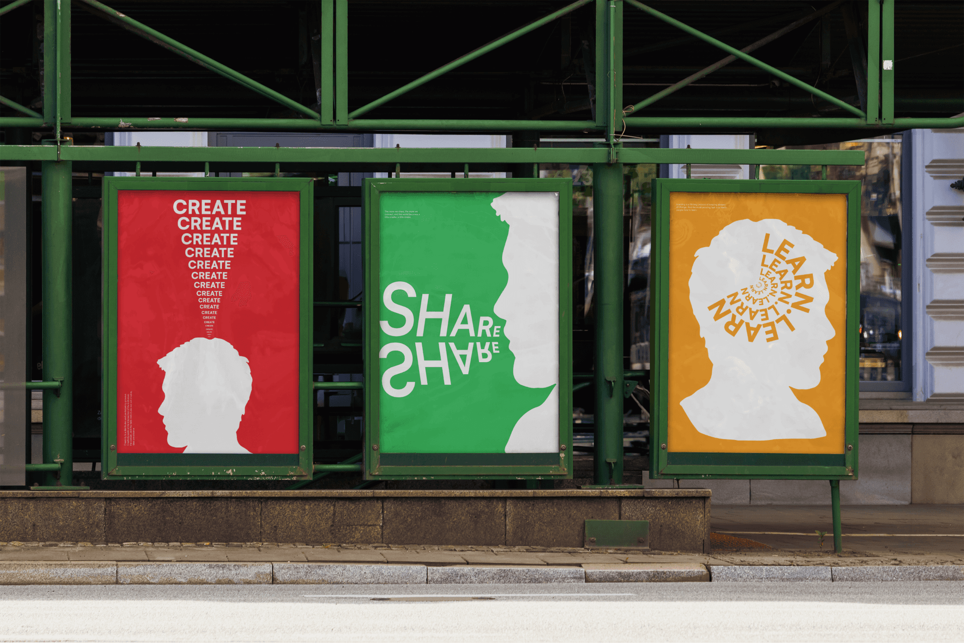
cultur was born from that spark — a space where designers and artists could create, share, and learn together.


The first attempt: A pause in the pandemic
A year later, in November 2020, I launched cultur’s first Instagram account from my hometown in Kerala, hoping to build an audience. However, the timing was challenging, as India was in the midst of the COVID-19 pandemic. With millions affected, most people had limited energy for new communities. The platform didn’t grow as I’d hoped, and I decided to pause.


Restarting in Bangalore
In June 2021, after moving to Bangalore, I started engaging with local creatives to understand what truly helps communities thrive. These conversations brought clarity and inspired me to reshape Cultur with a more focused and meaningful vision.
By May 2022, with renewed energy and purpose, Cultur was reborn — not just as an idea, but as a growing, people-centered community.

Finding our voice and visual identity
After restarting, we began to shape not just what cultur says, but how it says it. Together, we defined a tone that felt relatable, honest, and human — a voice that spoke to early-stage designers as peers, not as a brand broadcasting at them.
Alongside content, we designed a visual language that was minimal, warm, and intentional. Our posters used clean layouts and human-centered messaging — designed to feel like an open invitation, not a loud advertisement.


The original logo
Our first logo was hand-drawn to symbolize the personal development and craftsmanship behind building something meaningful. It represented the early, raw phase of the community — the individual effort, growth, and the imperfect but authentic beginnings.

The new logo
As cultur evolved, we needed a logo that reflected our growing community and its core values of inclusivity and equality. The redesigned logo is minimalist and uses all lowercase letters to convey a sense of equal opportunity and remove any sense of hierarchy.
This new design represents the collective strength of the community, where every member is equally valued and contributes to its growth. It’s a simple, purposeful mark that embodies the spirit of collaboration and shared progress.

Evolving the visual language: More than just a logo
The logo redesign marked a broader shift in how we presented cultur. Along with it, we refined our visual identity system to create a brand experience that felt both distinctive and aligned with our community’s personality.
Color palette
We retained and formalized our core color palette: a bold combination of red, white, and black.
red
#E60023
Reflects energy, creativity, and connection — the spirit of our community.
white
#FFFFFF
creates space and clarity, keeping our visuals clean and readable.
black
#000000
brings contrast, strength, and balance to the overall tone.
Typography
We introduced Satoshi, a clean and modern typeface that supports readability while giving the brand a confident yet approachable tone. Its geometric structure complements the overall aesthetic and reinforces our focus on clarity and balance.
Satoshi light
Satoshi light italic
Satoshi regular
Satoshi italic
Satoshi medium
Satoshi medium italic
Satoshi bold
Satoshi italic
Satoshi black
Satoshi black italic
Design style
Our new design direction embraces Neobrutalism — a visual style that’s bold, raw, and unapologetically real. With strong grids, high contrast, and minimal embellishment, this approach reflects our commitment to authenticity and the creative process in its truest form.


Together, these elements form a cohesive identity that expresses who we are: a grounded, growing, and purpose-driven design community.
The problem: A scattered creative landscape
As a designer, I often found myself surrounded by talent — but rarely by community.
Designers across India were creating incredible work, yet many felt isolated. There were Slack channels, Instagram pages, and event invites, but few spaces where meaningful, lasting connections could form.
There wasn’t a single place where you could just belong — where the focus was on people, not just portfolios.
Many creatives, especially early in their journey, lacked:

A support system

A space to show up as themselves
Opportunities to learn through others’ experiences
The vision: A place that connects you to the ones like you
cultur was born to change that — to bring designers together under one roof.. Our goal was simple: build a space where people could create, share, and learn — together.
We wanted to spark conversations, not just collect likes. We wanted to see designers collaborate on projects, not just comment “🔥” on Instagram. We envisioned:
Offline meetups where strangers became collaborators

Online spaces where feedback was real and helpful

A culture of giving back to the community
A place that connects you to the ones like you.
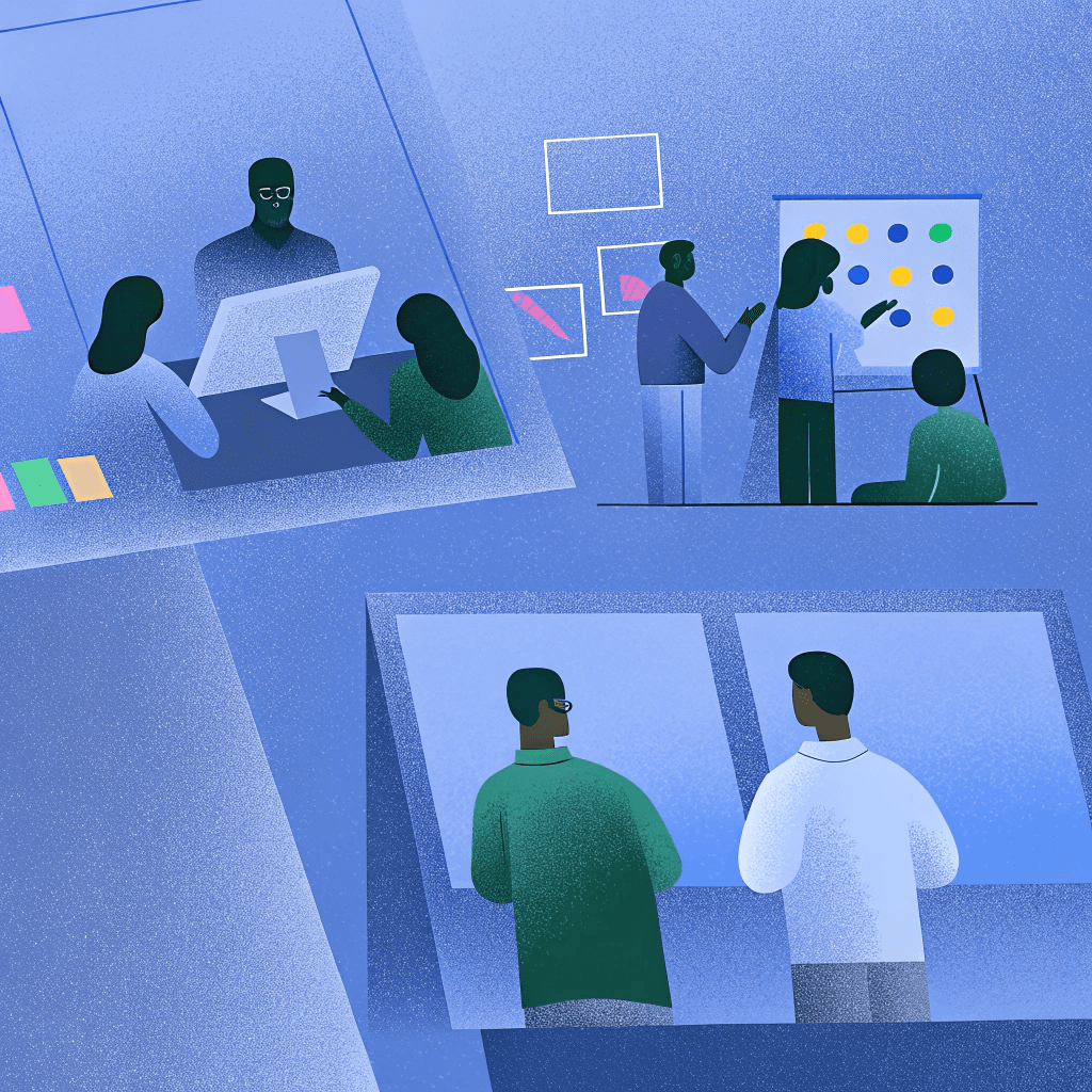
The approach: building cultur, One conversation at a time
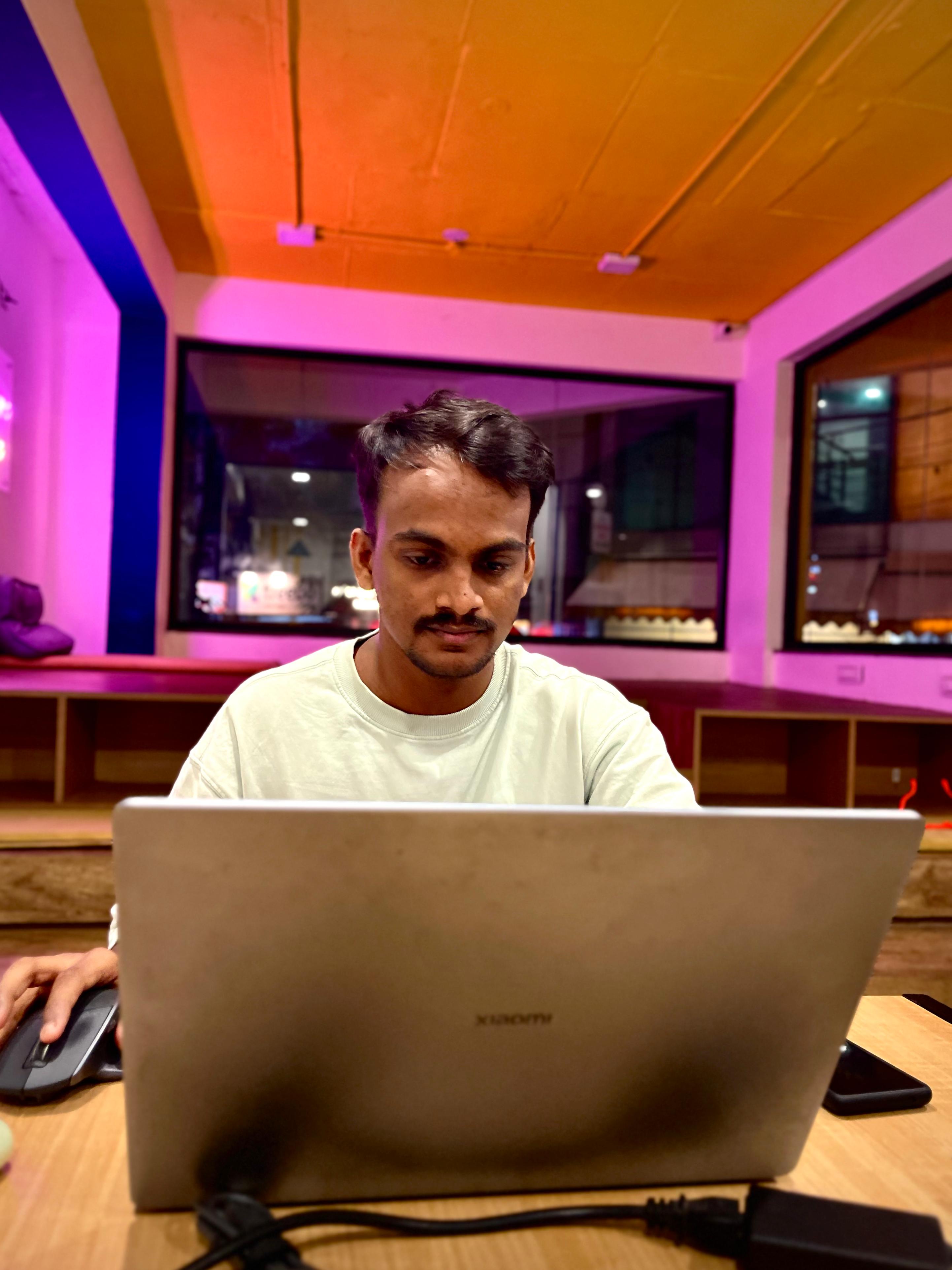
With a clear vision in mind, we focused on building cultur step-by-step through genuine conversations and community-led initiatives. We didn’t start with a business plan. We started with people.
After restarting cultur in Bangalore, I focused on listening — speaking with designers, artists, and creative folks at different stages of their journey. These conversations shaped our approach:
Start Small, Build Intentionally
We began by creating a tight-knit WhatsApp group — no mass invites, just a curated space of designers who genuinely cared about connection, not just content. What started as a small, intentional group has now grown into a community of over 1,400 members across multiple WhatsApp groups, each focused on building meaningful relationships and creative collaboration.
Anchor the community in real life
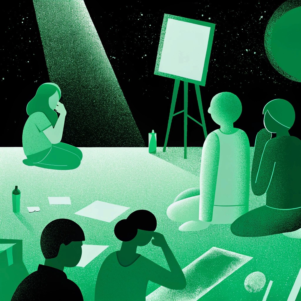
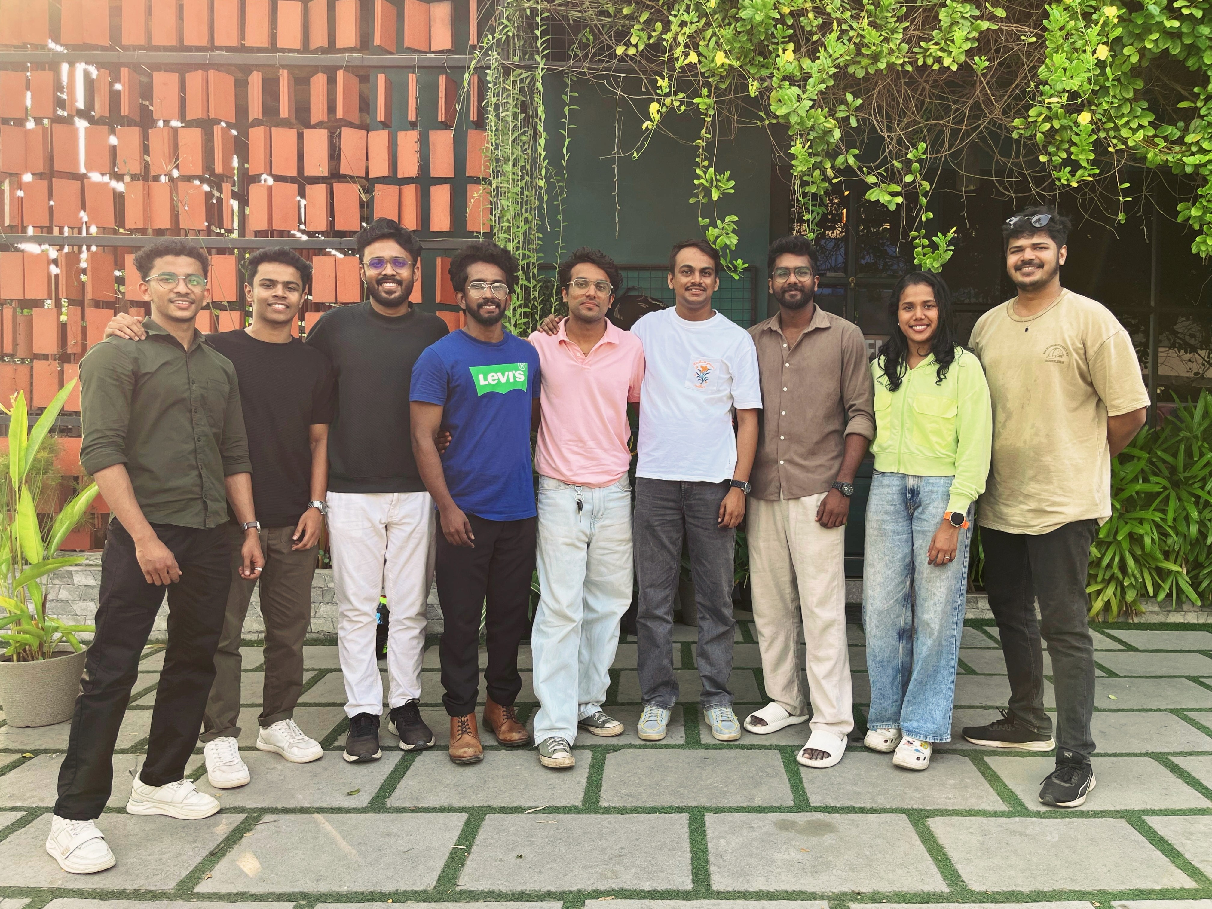
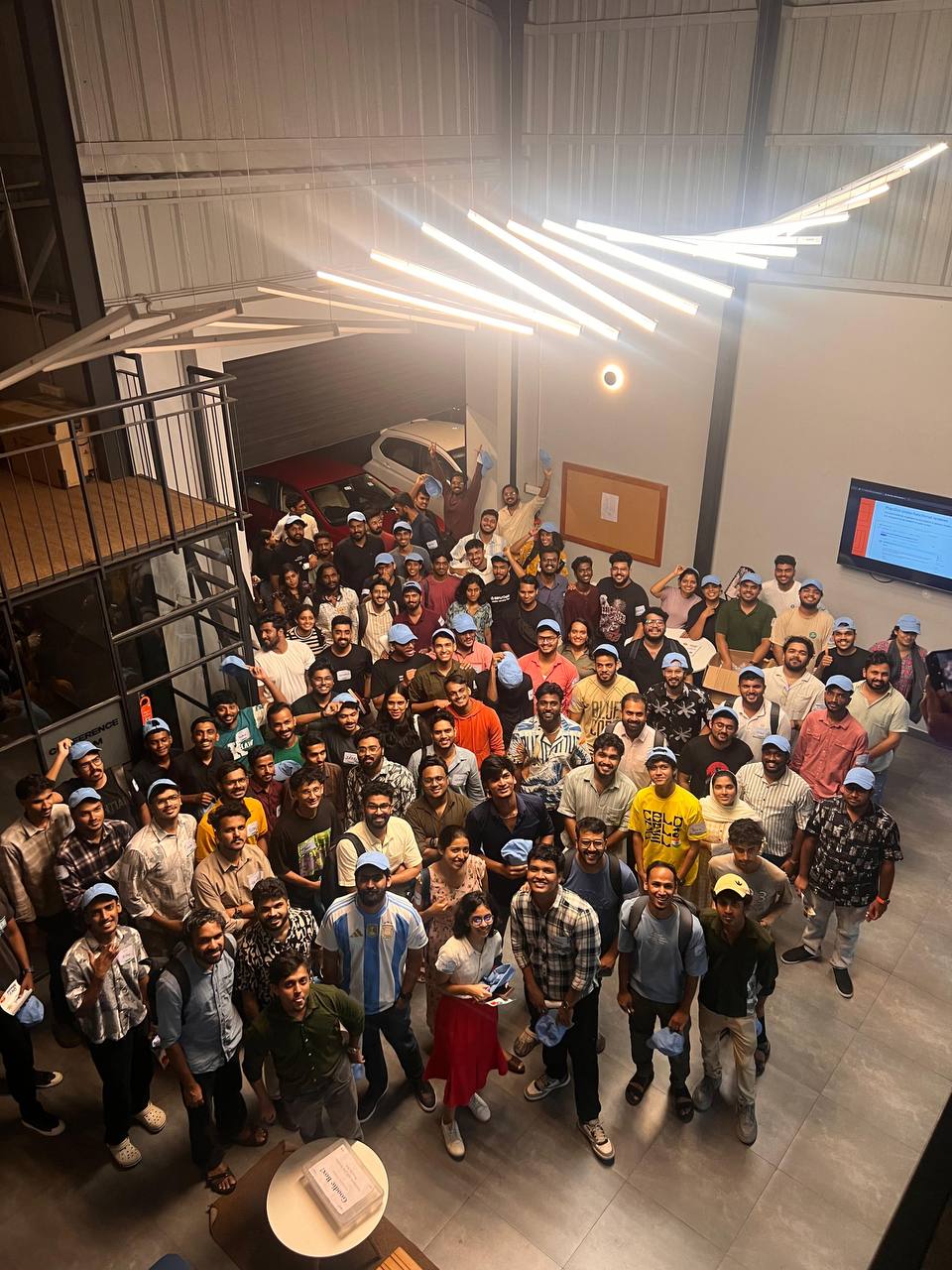
So we began hosting offline meetups — not formal events, but casual gatherings that felt more like designer friends catching up over coffee. These moments helped bring the essence of cultur to life: warm, welcoming, and rooted in genuine connection.
Our first in-person gathering happened in Lucknow, organized by Zee, an active member and early supporter of the community. It set the tone for what cultur could look like when led by its own people.
Lucknow, UP
Our first in-person gathering happened in Lucknow, organized by Zee, an active member and early supporter of the community. It set the tone for what cultur could look like when led by its own people.

Kochi, Kerala
The second meetup was hosted in Kochi by me, bringing together local creatives for a heartfelt, open-ended conversation around design and community.
Bengaluru, Karnataka
The third gathering took place in Bangalore, co-hosted with the design community Voxago, where we organized a Design Museum Walk — helping members connect through shared interests and casual networking.
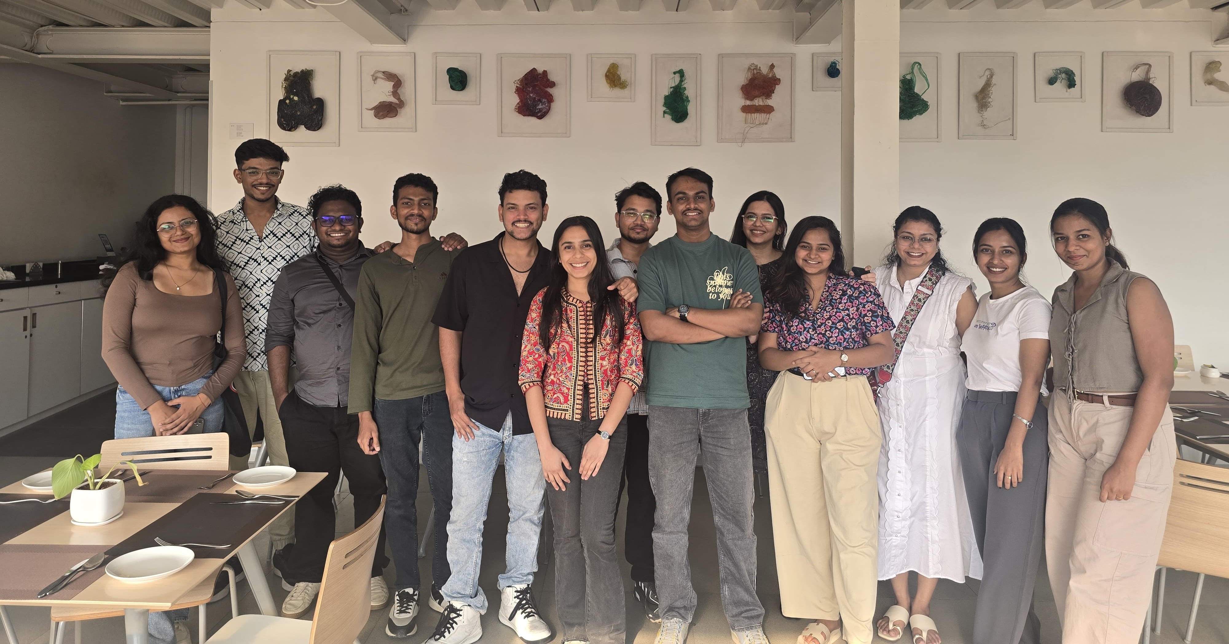
Each meetup reinforced the idea that real community is built one conversation, one connection, and one city at a time.
Expand through city-based communities
As interest grew, we created city-wise community groups to help members connect more locally.
Today, Cultur has active city chapters in:
Kochi
Bengaluru

Lucknow
Kozhikode
Mumbai
Chennai
These groups allow members to network, collaborate, and initiate their own local meetups — helping the community scale while keeping it personal.
Create themed spaces for growth
As the community evolved, we introduced interest-based subgroups to help members grow in specific directions:

cultur
Our main community group — a space where members engage in meaningful conversations, share ideas, and connect with fellow creatives

build
A space for showcasing projects, collaborating, and building creative ideas together.

fashion
For fashion designers and enthusiasts to explore design trends, projects, and inspiration.

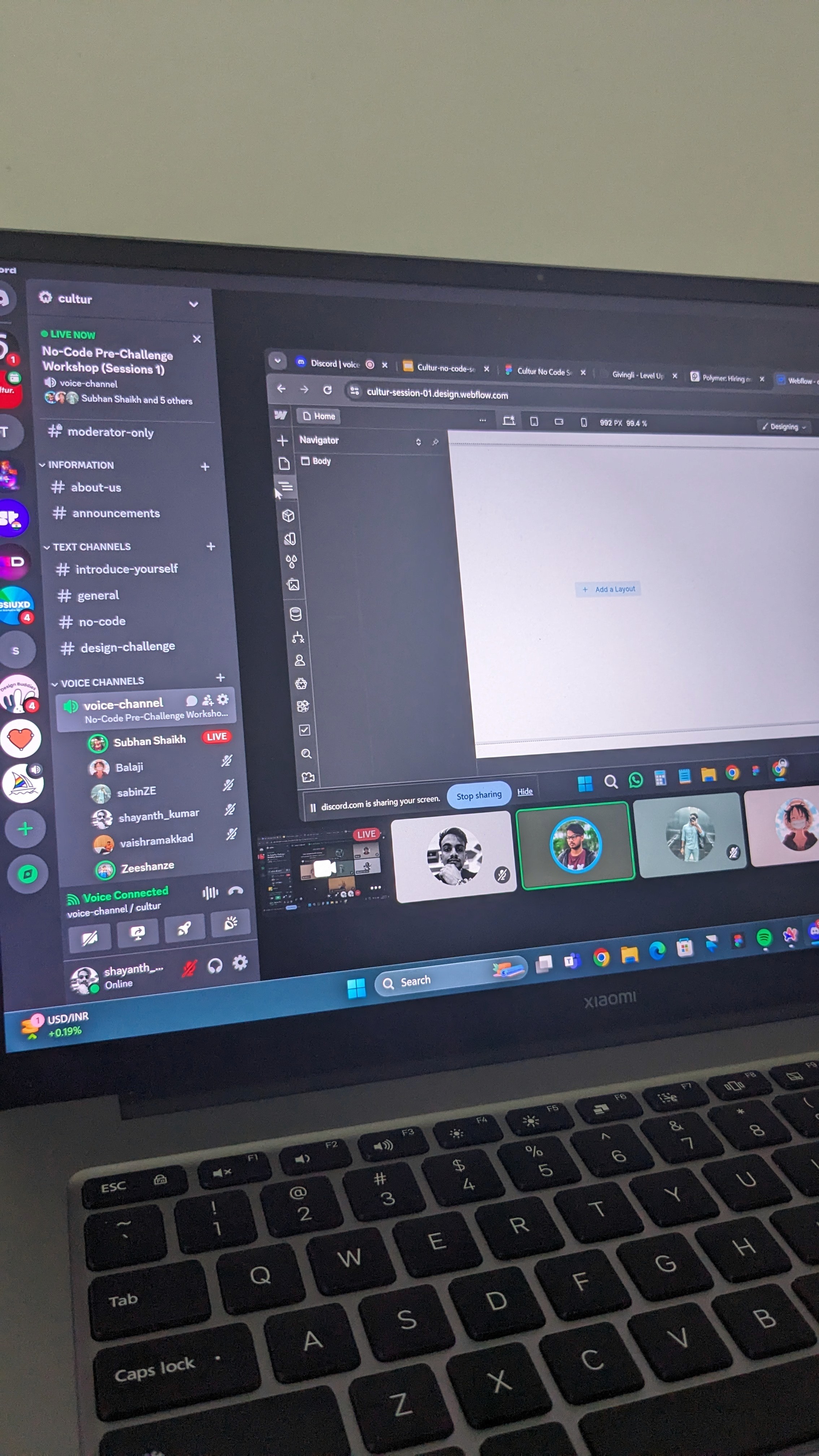
no-code
A space for creatives building with no-code tools — from websites to MVPs.

job portal
A curated job portal where members can find and share design opportunities.

news
A channel that shares the latest in design news, tools, trends, and resources, helping creatives stay sharp and up-to-date.
Each of these spaces is designed to deepen engagement, foster collaboration, and support creative growth.
Keep things flexible, yet purposeful
We never wanted cultur to feel like a rigid program or a content machine. Our guiding principle was simple:
Does this help someone create, share, or learn?
If yes, we moved forward. If not, we paused. That flexibility helped us grow with intention — always grounded in what mattered most: people.
Outcomes & impact: The real value of cultur
Since restarting, cultur has brought together over [insert number] designers and creatives across India. From newcomers to industry veterans, members have found a place to share their work, exchange feedback, and collaborate on projects. The in-person meetups in Kochi and Bangalore have been especially impactful, turning online relationships into genuine friendships.
Building meaningful connections
Since restarting, cultur has brought together over 1400+ designers and creatives across India. From newcomers to industry veterans, members have found a place to share their work, exchange feedback, and collaborate on projects. The in-person meetups in Kochi and Bangalore have been especially impactful, turning online relationships into genuine friendships.
Personal growth and vision
For me, cultur has been more than just a community — it’s a journey of learning how to lead, listen, and build with empathy. The process of growing cultur has deepened my understanding of what creatives need most: connection, inspiration, and practical support.

Future potential
cultur is evolving towards empowering others to build their own design communities. Our vision is to create a platform that enables people across India (and beyond) to launch, grow, and nurture their own creative communities — just like Cultur. This will help multiply the impact and connect more creatives in meaningful ways.
Thanks for taking the time to go through this. I appreciate your interest and hope it gave you valuable insight into my thinking and approach.